Category: Metroplex

  • Fort Worth City Council social media usage

    Yesterday, I looked at which city council members had a Twitter account.  Only three did: Mayor Betsy Price and Council Representatives Kathleen Hicks (District 8) and Joel Burns (District 9). Jungus Jordan’s name is registered as a Twitter username, however, the account has no tweets, followers or follows anyone else.

    By the numbers (as of 12/20/11, 10:56pm):

    • Betsy Price: 473 Tweets, following 995 accounts, followed by 1005 accounts; most tweets link to her official Facebook page that publishes pictures and stories of her recent engagements.
    • Kathleen Hicks: 3,994 Tweets, following 1,425 accounts and is followed by 896 accounts; Kathleen tweets, retweets and replies.
    • Joel Burns: 1,590 tweets,  following 2,920 accounts, followed by 5,329 accounts; tweets reflect personal and council rep duties.

    What about the rest of Fort Worth City Council?

    Danny Scarth

    • Website is well designed, specifically for campaigning. What interesting is the use of the Attribution-NonCommercial-NoDerivatives 3.0 Creative Commons license.  This means, anyone can repost content from his site so long as they attribute it and repost as is.
    • The site links to a Flickr account that hasn’t been updated in over 4 years.

    Sal Espino

    Zim Zimmerman

    • Decent looking website, strictly for campaigning; not very interactive.
    • Notable: There’s a news page that copies letters to the editor from the Star Telegram and Fort Worth Business Press. I wonder if his campaign received permission to do this.

    Frank Moss

    • There are lots of Frank Mosses in the world.  I could only find the Councilman’s Facebook page, which appears to not have been updated in some time.

    Jungus Jordan

    Dennis Shingleton

    • Similar to Frank Moss’s presence, limited to a campaign Facebook page.

    Kathleen Hicks

    • Very active on Twitter.
    • Has a web presence, however, not very findable; the site could use a design refresh and some search engine tweaks for findability.
    • Has a Flickr account for photos.

    Joel Burns

    • Very active on Twitter.
    • Has a clean website.

    Caveats

    All media use has a cost in time, effort and attention to create that media (even 140 character tweets). I’m going to err on the side of optimism and hope that each council rep is using their time appropriately, and also recognize they commit to events, meetings, phone calls and emails social media does not make public.

    Price, Hicks and Burns seem to have figured out a balance to stay engaged with constituents and remain active in their personal and professional duties while using social media.  I feel like they get modern, 21st century civic engagement and thus have gained my trust and respect.  And when used well, use of social media can do that to create effective civic outcomes.

    The Point

    Fort Worth is attempting to brand itself as a more modern city, engaged and aware of its citizens’ needs.  Per the SteerFW event:

    Employment Oportunities

    Goal: Create strong preception and brand for the city that will stimulate emerging entrepreneurial businesses — such as tech, health care, green and research industries — to grow into large employers for our city.

    Urban Development

    Goal: Encourage development that includes sustainability standards that encompass a balance/focus on environmental, economic and social consciousness for all local communities.

    It’s unfair to use a council rep’s adoption of Twitter as a metric for modern, connected civic engagement. They do good work. That should be appreciated. But the above two points rely on doing things differently and becoming connected in a different way that’s more agile, adaptable and astute.

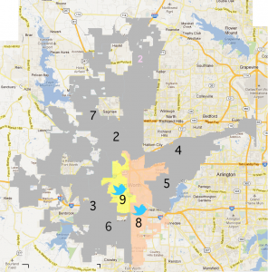
  • Fort Worth City Council Rep Twitter representation

    The Fort Worth City Council consists of nine members: the mayor and 8 city council representatives.  The current city council comprises of the following individuals:

    • Mayor: Betsy Price
    • District 2: Sap Espino
    • District 3: Zim Zimmerman
    • District 4: Danny Scarth
    • District 5: Frank Moss
    • District 6: Jungus Jordan
    • District 7: Dennis Shingleton
    • District 8: Kathleen Hicks – on Twitter
    • District 9: Joel Burns – on Twitter

    Below are two maps. Using the Fort Worth GIS city council overlays, I used Photoshop to layer the districts over a Google Maps still.  Due to the shape of the districts and lacking quality from the GIS, the overlay below is approximate.  Districts containing the Twitter bird represent those districts with a city council representative that has a Twitter account. The second, shows, for comparison, districts with a rep on Twitter versus the remainder of the city. Click the images to make larger.

    More analysis tomorrow.

    Fort Worth City Council Districts and Twitter representation


    Fort Worth City Council Districts and reps with Twitter accounts
  • Review of the Star Telegram iPad app

    Summary: The Star Telegram app is functional app that delivers content well, but restricts and undervalues the content. Pros: great value, photos look great, environmentally friendly, solid delivery of content. Cons: You’re reading a PDF at first, inconsistent browsing behaviors, the power of the iPad is underutilized, download times vary.

    Price: The app is free, with $2/month for print subscribers, $7.99/month, $75/year. This seems like a fair value, or an outright deal if you crunch the numbers compared to buying a paper a day or even subscribing to the print edition. Upon opening the app, you’ll need to sign in to download editions. If you have a Star Telegram Account, you can do this, and add subscriptions to your account, or you can purchase a one month subscription from within the app.

    Star Telegram iPad app first screen

    The physical layout is the paper layout–familiar but outdated. The iPad can richly deliver text, images and video, with unique behavioral interactions, yet the content remains constrained to a print layout. You cannot select text in this “paper” format. Pictures are vibrant and crisp and benefit the most from the app–no more misaligned color plates or inconsistent coloring ruining photos. Personally, I’d like to see a behavior to zoom in on images or make them full screen. Text is crisp similar to a well formatted PDF, but has to rejigger itself every time you zoom in and out. This is a disadvantage of constraining a print format within a digital format.

    Depending on the amount of content in the paper for the day will determine how long it takes to download the day’s edition. Mondays take about 2 minutes, while Sundays take nearly 10 minutes over a high speed internet connection. [This was done at home over a Uverse broadband connection, with the iPad connected wirelessly.] Ads remain prominent, and in Sunday editions, most advertising inserts are not included–very limited set of coupons, no store inserts such as Best Buy ad, etc. Yet the Parade insert is included.

    Navigation/Interaction

    Initial navigation is to read the paper, a PDF-like image of the paper

    • Swipe or touch translucent blue tabs to change pages
    • Pinch and expand to zoom out/zoom in, respectively
    • Single click on an article to zoom in on it
    • Double clicking on an article will bring up a native text format article, where text size can be changed larger or smaller for readability and copied. You can browse to other text articles via the up and down arrows on the menu. Can also share via email, Facebook or Twitter. The email sharing crashed the app for me, and the Facebook and Twitter sharing worked as expected, where you sign in, or authorize, the ST app to use the respective service to share the app.

    Re: Facebook sharing. Why, WHY, does the Star Telegram app need “my name, profile picture, gender, networks, list of friends and any other information I’ve shared with anyone?” I could very easily go to the site, copy the equivalent link for the story and then paste it into Facebook. I refused.

    Re: Twitter sharing. Very straight forward, The tweet turns into something like, “Check out this article: (headline) (Bitly shortlink),” which you can edit before posting.

    There is no print capability. If you’d like to print out a recipe, or blurb, it might be best to go to the Star Telegram site and print it. (Or email it to yourself, if the email function works for you.)

    Menu

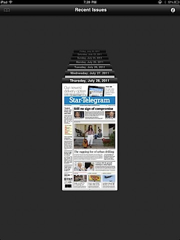
    • Can browse 7 days of back issues
      st_app_screens 6 Star Telegram iPad app issue browser  

    • Can bookmark articles for later reading
    • Can search the current paper
    • Three ways to browse sections

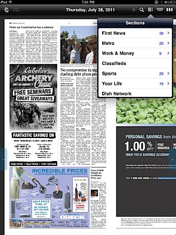
    A. Drop down menu of sections, includes a count of news stories within that section. Touch a section and a list of stories will appear. Touch a headline, and the behavior of the app will take you to the “paper” view of the story, not the readable, full text of the story. If you click on a front page article, or a column that jumps to another page, you then have to click again to get to the rest of the article. Why not go to the full article?

    Star Telegram iPad app drop down menu

    B. A series of tabs can be overlaid for each section, and remain there until you go to a text article or choose to make them go away.

    Star Telegram iPad app tab menus

    C. The River of Digital Paper. Take each flat of 2 pages, line them all up in a row, and make them scroll left or right, depending on where you’d like to browse. It’s an interesting way browse, to get a sense of scale and general idea to hop to a section. You can pinch and expand as you would the rest of the paper, however, It’s not very readable. Quite frankly, you can see all the ads and determine how much content there’s in the paper, which seems sad when put in this perspective.

    Star Telegram iPad appriver of digital news

    Misc.

    Blue highlighted text is clickable–email, websites, phone numbers, in both the paper and text versions of the articles.

    If app is minimized, or closed, and reopened, it will take you back to where you were. If a day passes, the app will take you to the front page for that day.

    Other tests

    Out of curiosity, I did an airplane test, or what can I do without an internet connection test. It appears, if you’d like to read the Star Telegram iPad app without a connection, you must first connect and download the edition you’d like. That makes sense. However, you’re limited to the “paper” version. You cannot double click to get a text formatted article. Not horrible, but slightly disappointing.

    Also, I did a Mom test. I handed the iPad to my mother, and asked her to browse the paper. For the most part, she figured it out, but there were two hang ups. The Search icon is a magnifying glass, which to her meant to zoom in. She wanted to zoom but didn’t get it. Perhaps a different icon would help? Secondly, once she found the text version of the article, she tried to swipe left and right to the next articles. This is inconsistent with what you’d do in the paper version. Why make the behaviors different?

    Potential and final thoughts

    I’ve lived in Fort Worth for nearly 12 years, and remember the Star Telegram as a content rich paper, with numerous features and news articles. In those 12 years, it’s devolved into a shell for sparse local coverage and wire service articles. Have you picked up a Monday paper in a while? It’s sad, kind of like seeing a loved one lose too much weight to the point they look unhealthy.

    The iPad app is a healthy boost for the content, but I can’t help feel it’s restricting the content they wish to provide. Here’s a device that 12 years ago existed in the fantasy of science fiction, yet, is being treated as a digital microfiche viewer, you know, those bulky boxes where you’d put a film slide of newspaper over a light and you could view it. At the time, that was a great way to share archives of newspapers. Today, treating your content as microfiche film undervalues it.

    Make it rich, make it interactive, get out of the grid of a print layout. Why can’t advertising go to the sponsor’s website (business opportunity!)? Why can’t Amazon affiliate links go into content (business opportunity!)? Why can’t trailers (or Galloway and Hate videos) be included for movies, books and whatever else (business opportunity!)? Why can’t classifieds be structured differently, ala a Craig’s List, instead of squinty little boxes, a holdover from the 19th century (business opportunity!)? Why can’t daily deals, the Star Telegram equivalent of Groupon (business opportunity!), be integrated? The photos look great, why not add photo stories, ala The Big Picture to focus on the vivid and diverse settings and people of the Metroplex.

    Granted, this is a 1.0 app, and with first versions, you want to get the core feature set right, which, for the most part, they did. The app is functional, and the content is there, and feels much better than the Star Telegram website.

  • Thoughts on Fort Worth mayoral campaign signs

    On June 18th, the Fort Worth Mayoral run off will be held between Betsy Price and Jim Lane. Through out the entire campaign, their respective signs stood along roadsides and street corners. Regardless of where they fall on the political spectrum, their signage is interesting as well as signage for the other candidates. Below are some thoughts on the designs of all 5 Fort Worth Mayoral candidates, in order of least to most popular vote percentage from the May 14th election. All images found via Google Image’s cache and copyright their respective owners. I have no affiliation with any candidate.

    Nicholas Zebrun

    nicholas zebrun mayoral sign

    All during the campaign, I never once saw this sign. I recall seeing a blue and white sign with some sort of stylized star, nor can I track down any images of the sign I’m thinking of. This design is high contrast sans serif type face, white against red. Zebrun and mayor are weighted, made bold, for impact and visibility. The drop shadow gives the type depth. Aside from the red and white contrast, nothing stands out, nor would I think this to be memorable.

    Dan Barrett

    dan barrett mayoral sign

    Again, we see the high contrast, eye catching red and white design. Barrett has several other things going on. His first name is skewed, albeit disproportionately to his last name. The last name, is skewed in such a way that it gives a sense of perspective–alluding to a path, or a way, or he has perspective on the issues? The skewing, renders the sign, “Dan B”. The tagline, “A New Way for Fort Worth”, is placed in the additional empty space, made by the distortion of his last name. Also, the alignment of the text needs work–Dan and Barrett should be better aligned, as does the tagline. Unless this sign is large, it’s not very readable.

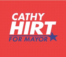
    Cathy Hirt

    cathy hirt mayoral sign

    Cathy Hirt’s sign is visually interesting and appealing. Good typography–alignment and weighting of text, plus, the “for mayor” and the star flourish make this attractive. “Hirt” is dramatic and bold–definitely stands out, and the “for mayor” is interesting enough that the brain will make the connection. This sign will work for print and posters. Two concerns, however, are that the blue could be hard to read in passing or if the person was colorblind.

    Jim Lane

    jim lane mayoral sign

    Jim Lane’s sign is the first to break away from the red and white sans serif design. The other candidates up to this point emphasized their last names. Lane uses the brevity of his seven letters to an advantage–JIM LANE, in a distinctive typeface. The “FOR MAYOR” contrasts well between his name and the longhorn. The longhorn. It’s very similar, if not the same as the City of Fort Worth’s logo, except in a different color. Does it help? Yes. Take it away, and the sign is generic. With the longhorn, it’s an image associated with anything Fort Worth–so much that it could easily blend in with all the other Fort Worth signage as Yet Another Fort Worth Sign.

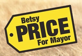
    Betsy Price

    betsy price mayoral sign

    Betsy Price has luck from her namesake to help with a clever, interesting and playful design in that of a “Price” tag. The design is shaped uniquely with high contrast black sans serif text on a yellow background. It’ll work large and small. The similarity to the Best Buy logo is uncanny–and will definitely catch people’s attention. Price’s use of an already existing visual works, whereas Lane’s does not.

    Conclusion

    High contrast, clean design, visually appealing and, if you can pull it off, add something unique. Plus, use the roadside test. Can you see, and remember, the sign in the brief moments someone may take to look at it? If you can only afford small signs, they better be clear and distinctive.

  • Telegraph Canyon at the Levitt – 9/17/2010

    Fort Worth’s Telegraph Canyon played Arlington for the first time at the outdoor amphitheater, Levitt Pavilion. The band played an energetic, swirling and full set with songs off their 2009 The Tide and the Current. This is a band that sounds better live with performances to match. Rich textures and instrumentation ebb, flow and build in songs like Into the Woods and Reels and Wires. Welcome to the Night becomes raw and tender and pulsating.

    This is the second time I’ve seen them and they’re there to play and rock out in their own way. Lead singer Chris Johnson interacted with the crowd a few times, but all six band members where there to play. No theatrics or showmanship. I would like to see them throw in a cover just to see what they could do with someone else’s material. By then end of the show a line had formed at their merchandise table and I could overhear conversations about how impressed they were with the band.

    Telegraph Canyon at the Levitt

  • Lanny’s Alta Cocina

    Lanny’s Alta Cocina Mexicana, located at 3405 W. 7th St. in Fort Worth, provides a welcoming, relaxed and upscale dinner experience. Inside an old, one story World War II era house, only a dozen or so tables are available for seating. I saw about ten tables of various sizes, small tables for couples, tables seating four and larger set ups of either round or rectangular for bigger gatherings. An inviting waitstaff never rushes your menu choices and seem keenly observant as when to approach for another drink or additional water or when to offer to take your plate away. A full bar is stocked with top shelf liquor and the wine cellar is on full display behind glass doors. In a sense, it’s comfortably trendy, removed from the pretentiousness some upscale places offer–warmly lit with music quiet enough to share an intimate conversation over good food.

    The food is a unique take on gourmet Mexican with several fish entrees. First, the bread. Lanny’s bread is amazing. Hearty wheat bread, flavored with herbs they probably pick from the garden growing outside is served fresh from the oven and comes with an oil and chile garnish. I split a tapas of Kobe carpaccio and light greens. The raw beef was light and flavorful and melted richly upon first bite. For my main course, I had the potato wrapped sea bass. Paper thin and fried potato slices wrapped the large server of meat, holding in the juices. It came served atop a bed of rice with olives, cheery tomatoes and a thin, light sauce.

    Lanny’s is a place where you go and spend the entire evening. It’s high dollar, but you’re paying for one of the more unique restaurants in Fort Worth that provides a slow, relaxed and friendly atmosphere to enjoy company and food.


    View Larger Map

  • Paper Arts, Dallas, TX

    Tucked away in a small strip center South of downtown Dallas (Peak and Elm), Paper Arts offers a mind boggling selection of papers from all over the world. One of a kind, hand crafted, exotic, off beat, special purpose–they have it or can get it. In my own impromptu tour, I was told that “we have access to 8000 different kinds of paper, but only have 1500 in stock” at the store. In a sense, if you like paper, you’d be like a kid in a candy store with the ceiling high cabinets full of brightly colored offerings.

    In meandering the store, looking at what there is to offer, scrap bookers have options with patterns and brightly colored stock, but the heart of the store is for those that need a unique feel, beyond what the paper aisle at Hobby Lobby or Micheal’s offers. Wedding invitation designers can find elegant and contemporary stock for the occasion. Collage artists can find one of a kind (literally, there’s only one sheet with that pattern), hand marbled papers and papers with various thicknesses, translucence and tension. Origami folders can find wet and dry folding stock. Book makers can find cloth papers with special backings to prevent glue from seeping through. Papers are sold in half sheet or whole sheet options, sizes ranging from 8.5″ x 11″ to 32″ x 40″. Prices vary from $1.99 a sheet (basic papers) to $20 a sheet (specialty, exotic paper).

    The owners are friendly, extremely knowledgeable and willing to help you find what you’re looking for. Mention you want something like XYZ but in a different ABC or 123, and they’ll guide you to a cabinet with suggestions.

    Paper Arts is open Tuesday through Saturday and can be reached by phone at 214-828-9494


    View Larger Map