Summary: The Star Telegram app is functional app that delivers content well, but restricts and undervalues the content. Pros: great value, photos look great, environmentally friendly, solid delivery of content. Cons: You’re reading a PDF at first, inconsistent browsing behaviors, the power of the iPad is underutilized, download times vary.
Price: The app is free, with $2/month for print subscribers, $7.99/month, $75/year. This seems like a fair value, or an outright deal if you crunch the numbers compared to buying a paper a day or even subscribing to the print edition. Upon opening the app, you’ll need to sign in to download editions. If you have a Star Telegram Account, you can do this, and add subscriptions to your account, or you can purchase a one month subscription from within the app.

The physical layout is the paper layout–familiar but outdated. The iPad can richly deliver text, images and video, with unique behavioral interactions, yet the content remains constrained to a print layout. You cannot select text in this “paper” format. Pictures are vibrant and crisp and benefit the most from the app–no more misaligned color plates or inconsistent coloring ruining photos. Personally, I’d like to see a behavior to zoom in on images or make them full screen. Text is crisp similar to a well formatted PDF, but has to rejigger itself every time you zoom in and out. This is a disadvantage of constraining a print format within a digital format.
Depending on the amount of content in the paper for the day will determine how long it takes to download the day’s edition. Mondays take about 2 minutes, while Sundays take nearly 10 minutes over a high speed internet connection. [This was done at home over a Uverse broadband connection, with the iPad connected wirelessly.] Ads remain prominent, and in Sunday editions, most advertising inserts are not included–very limited set of coupons, no store inserts such as Best Buy ad, etc. Yet the Parade insert is included.
Navigation/Interaction
Initial navigation is to read the paper, a PDF-like image of the paper
- Swipe or touch translucent blue tabs to change pages
- Pinch and expand to zoom out/zoom in, respectively
- Single click on an article to zoom in on it
- Double clicking on an article will bring up a native text format article, where text size can be changed larger or smaller for readability and copied. You can browse to other text articles via the up and down arrows on the menu. Can also share via email, Facebook or Twitter. The email sharing crashed the app for me, and the Facebook and Twitter sharing worked as expected, where you sign in, or authorize, the ST app to use the respective service to share the app.
Re: Facebook sharing. Why, WHY, does the Star Telegram app need “my name, profile picture, gender, networks, list of friends and any other information I’ve shared with anyone?” I could very easily go to the site, copy the equivalent link for the story and then paste it into Facebook. I refused.
Re: Twitter sharing. Very straight forward, The tweet turns into something like, “Check out this article: (headline) (Bitly shortlink),” which you can edit before posting.
There is no print capability. If you’d like to print out a recipe, or blurb, it might be best to go to the Star Telegram site and print it. (Or email it to yourself, if the email function works for you.)
Menu
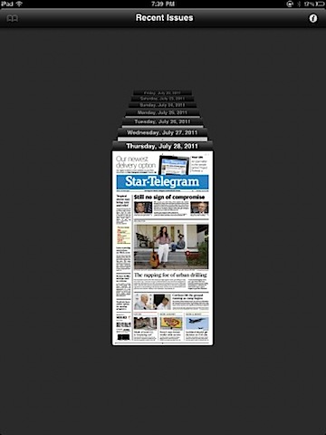
- Can browse 7 days of back issues


- Can bookmark articles for later reading
- Can search the current paper
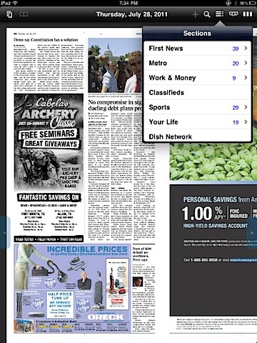
- Three ways to browse sections
A. Drop down menu of sections, includes a count of news stories within that section. Touch a section and a list of stories will appear. Touch a headline, and the behavior of the app will take you to the “paper” view of the story, not the readable, full text of the story. If you click on a front page article, or a column that jumps to another page, you then have to click again to get to the rest of the article. Why not go to the full article?

B. A series of tabs can be overlaid for each section, and remain there until you go to a text article or choose to make them go away.

C. The River of Digital Paper. Take each flat of 2 pages, line them all up in a row, and make them scroll left or right, depending on where you’d like to browse. It’s an interesting way browse, to get a sense of scale and general idea to hop to a section. You can pinch and expand as you would the rest of the paper, however, It’s not very readable. Quite frankly, you can see all the ads and determine how much content there’s in the paper, which seems sad when put in this perspective.

Misc.
Blue highlighted text is clickable–email, websites, phone numbers, in both the paper and text versions of the articles.
If app is minimized, or closed, and reopened, it will take you back to where you were. If a day passes, the app will take you to the front page for that day.
Other tests
Out of curiosity, I did an airplane test, or what can I do without an internet connection test. It appears, if you’d like to read the Star Telegram iPad app without a connection, you must first connect and download the edition you’d like. That makes sense. However, you’re limited to the “paper” version. You cannot double click to get a text formatted article. Not horrible, but slightly disappointing.
Also, I did a Mom test. I handed the iPad to my mother, and asked her to browse the paper. For the most part, she figured it out, but there were two hang ups. The Search icon is a magnifying glass, which to her meant to zoom in. She wanted to zoom but didn’t get it. Perhaps a different icon would help? Secondly, once she found the text version of the article, she tried to swipe left and right to the next articles. This is inconsistent with what you’d do in the paper version. Why make the behaviors different?
Potential and final thoughts
I’ve lived in Fort Worth for nearly 12 years, and remember the Star Telegram as a content rich paper, with numerous features and news articles. In those 12 years, it’s devolved into a shell for sparse local coverage and wire service articles. Have you picked up a Monday paper in a while? It’s sad, kind of like seeing a loved one lose too much weight to the point they look unhealthy.
The iPad app is a healthy boost for the content, but I can’t help feel it’s restricting the content they wish to provide. Here’s a device that 12 years ago existed in the fantasy of science fiction, yet, is being treated as a digital microfiche viewer, you know, those bulky boxes where you’d put a film slide of newspaper over a light and you could view it. At the time, that was a great way to share archives of newspapers. Today, treating your content as microfiche film undervalues it.
Make it rich, make it interactive, get out of the grid of a print layout. Why can’t advertising go to the sponsor’s website (business opportunity!)? Why can’t Amazon affiliate links go into content (business opportunity!)? Why can’t trailers (or Galloway and Hate videos) be included for movies, books and whatever else (business opportunity!)? Why can’t classifieds be structured differently, ala a Craig’s List, instead of squinty little boxes, a holdover from the 19th century (business opportunity!)? Why can’t daily deals, the Star Telegram equivalent of Groupon (business opportunity!), be integrated? The photos look great, why not add photo stories, ala The Big Picture to focus on the vivid and diverse settings and people of the Metroplex.
Granted, this is a 1.0 app, and with first versions, you want to get the core feature set right, which, for the most part, they did. The app is functional, and the content is there, and feels much better than the Star Telegram website.