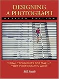
Designing a Photograph: Visual Techniques for Making Your Photographs Work by Bill Smith takes a designer’s view of to a photograph. Visually, what makes something interesting or engaging, and apply it to a photograph. Smith makes the argument of knowing how to pay attention to groups of visuals. These visuals include:
- Figure ground
- selective focus
- similar color
- closure
- continuation
- similar size and shape
- similar texture
- object proximity
The book includes exercises for the reader to perform (shoot in bursts, look at a subject a variety of different ways). Later in the book, Smith details when black and white works better or if color is optimal. Consider contrast and tones and how light affects both.
Images do have f stop and lens information for those curious of technical details.
Designing feels dated, even for 2001, retaining sample images taken with Kodachrome. Kodachrome is dead, and even in 2001 was gasping its final breaths. Ignoring that, applying a designer’s eye to photography can help tremendously with composition and achieving the desired impact.
Leave a Reply